Hi, I'm Mariam Lobjanidze
I'm a business reporter based in New York City and cover stories through the lens of data. I recently got an M.S in data journalism from Columbia Graduate School of Journalism. Aside from journalism, I like traveling, writing fiction, and learning new languages. On this website, you can find my data projects. Feel free to reach out to me at ml4998@columbia.edu
See my published work on The Real Deal, Indianapolis Monthly, Columbia News Service, Columbia Engineering Magazine, WFYI Public Media, and The DePauw.
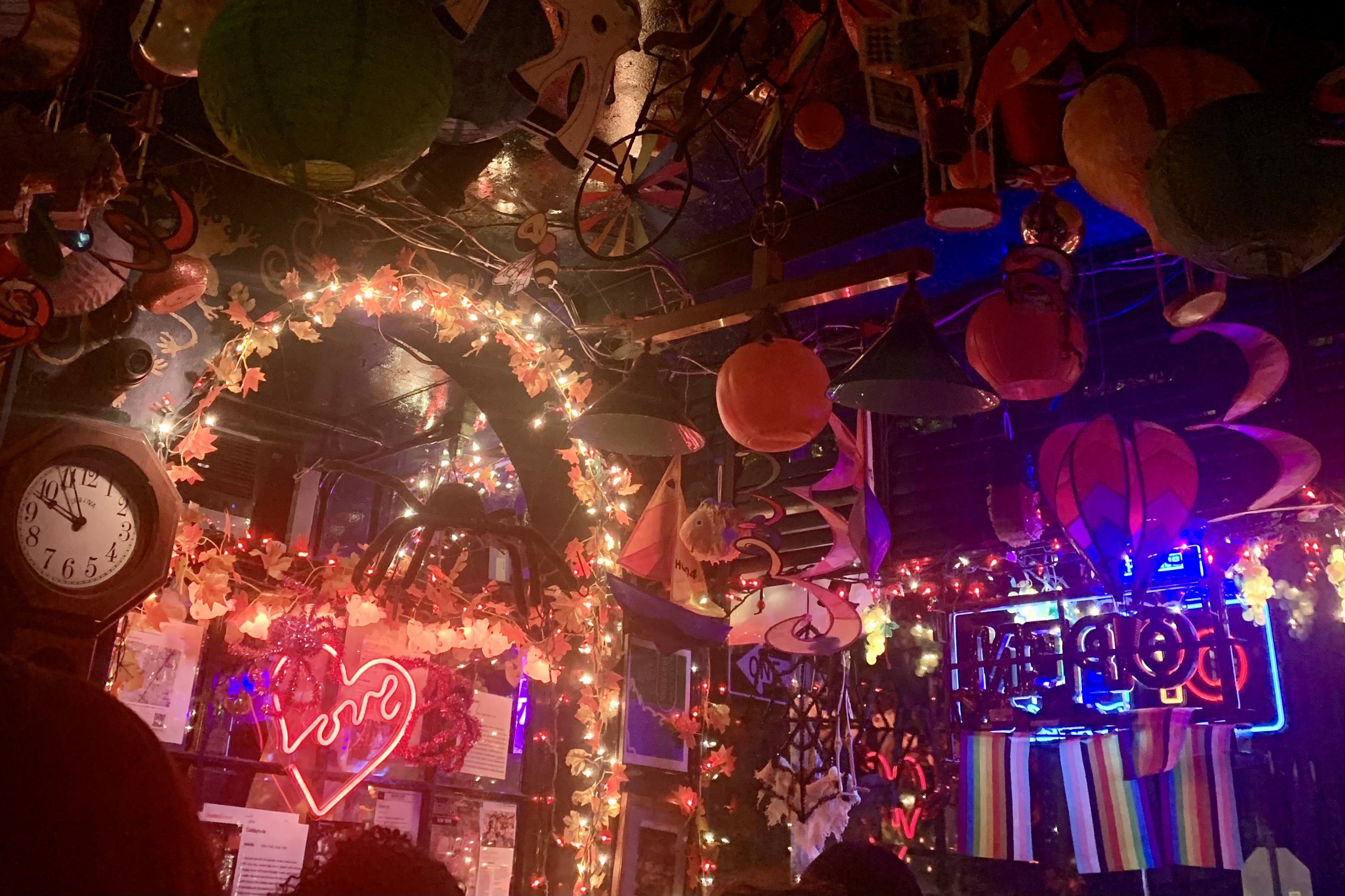
Are lesbian bars a new trend in 2024? This project showcases historic data on the number of lesbian bars in the country as well as a map of all the current lesbian bars. I used scrollytelling to form my narrative as well as expert and patron interviews to investigate why lesbian-owned bars are on the rise.
- Scrollytelling usingJavascript
- Visualizing the data with Datawrapper

The NYC Resident Doctors project explores the pay disparity between residents at public hospitals versus private hospitals. To explore the issue and collect data, I interviewed five resident doctors from various hospitals as well as representatives from the Committee of Interns and Residents (CIR). I analyzed the data using pandas and visualized it using ggplot.
- Analyzing data using pandas
- Visualizing the data with ggplot
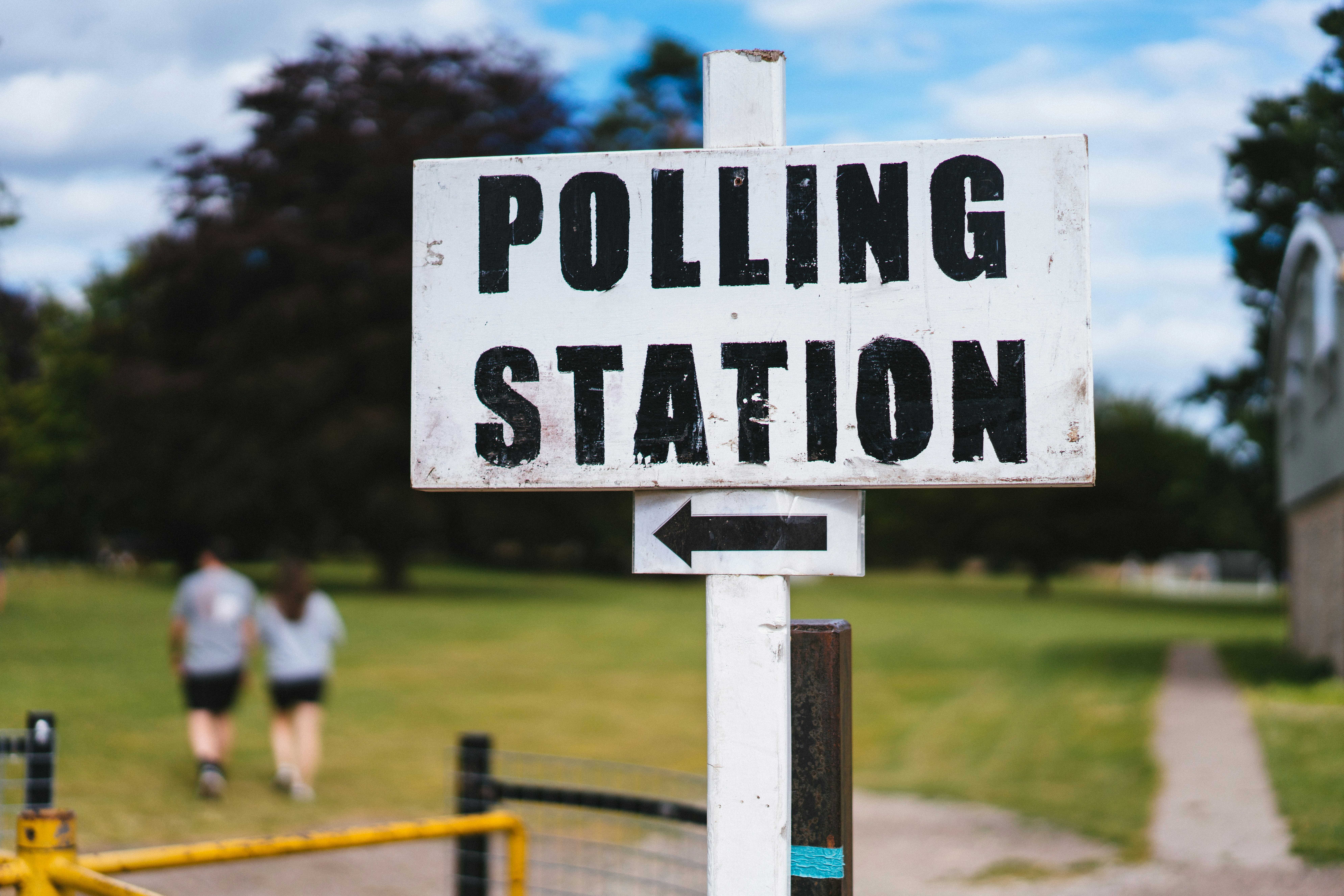
This project analyzed voter participation in low-turnout NYC communities by merging datasets from the NYC Campaign Finance Board, CUNY Graduate Center, and the NYC Board of Elections. Using Python and R, I focused on council districts with high immigrant populations and voter turnout data from the 2021 election to identify underrepresented areas.
- Data merging and cleaning usingpython.
- Using dataWrapper to visualize data

This project showcases housing and eviction trends in NYC pre and post-COVID-19. In reporting this story, I merged and analyzed data from Census and NYC Open Data using Python and R.
- Statistical analysis using multivariable linear regressions, t-tests, and chi squared tests
- Analyzing data with Python and R

In the BBC movie project, I utilized web scraping tools such as Beautiful Soup and Playwright, complemented with regular expressions, to extract data from the BBC's website. This effort resulted in a searchable database composed of multiple CSV files, featuring a comprehensive list of movie directors, film titles, critics, director nationalities, and links to their IMDB profiles
- Scraping with Playwright and BeautifulSoup
- Using Python to clean and analyze the data
- Using datawrapper to visualize the data

In this project, I used data from NielsenIQ to analyze pumpkin spice sales and see trends. In addition, I interviewed experts across the country to get insights about the changes in pumpkin spice sales.
- Data analysis with pivot tables
- Using dataWrapper to visualize data

This project involves business and labor reporting including interviews with professors at Manhattan College and the administration to examine what the current layoffs mean for higher education and the tenure system.
- investigative business reporting
- long-form writing
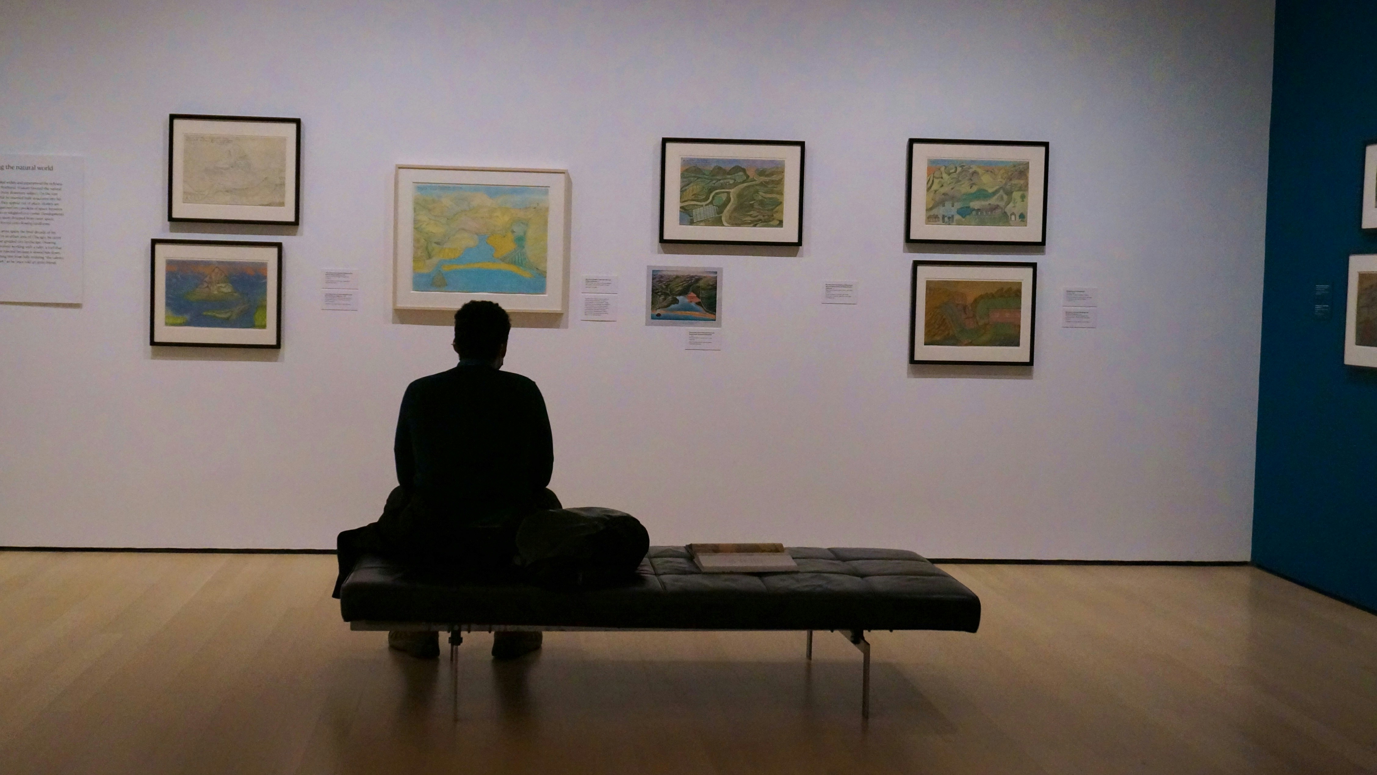
The MOMA diversity project goes in depth about the gender and ethnic dynamics of the artists showcased at the museum. I used MOMA’s archives and cleaned up their data in order to visualize how the top 10 countries, continents, and genders that MOMA’a artists represent. I used ggplot and DataWrapper to visualize my findings and interviewed a museum-studies student to understand what the data means.
- Using Python to clean the data
- Visualizing the data with Datawrapper and ggplot

This project showcases two types of data visualizations: a map highlighting the most popular pizza styles in each U.S. state and a chart detailing the popularity rankings of different pizza styles by state. The data, manually compiled into two CSV files, includes the count of states preferring specific pizza styles and the preferred pizza style of each state. The visualizations were created using Datawrapper.
- Collecting data from from this website
- Visualizing the data with Datawrapper

This project showcases some of the most iconic buildings and their arcitectural history in New York City
- Collecting data from from this website
- VisualsScrollytelling and 3D Models